
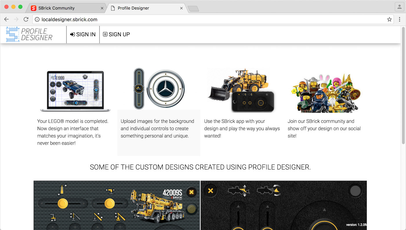
Here you will find instructions, explanations and descriptions of our Profile Designer. Reading it should help you quickly get acquainted with this service. To actually start using it, head over to the Profile Designer using this link: https://designer.sbrick.com
You have to be registered, and signed in to our Social site in order to use the Profile Designer. The links on the header are bring you to the desired place. If you logged in, you will be redirected to the Profile Designer.
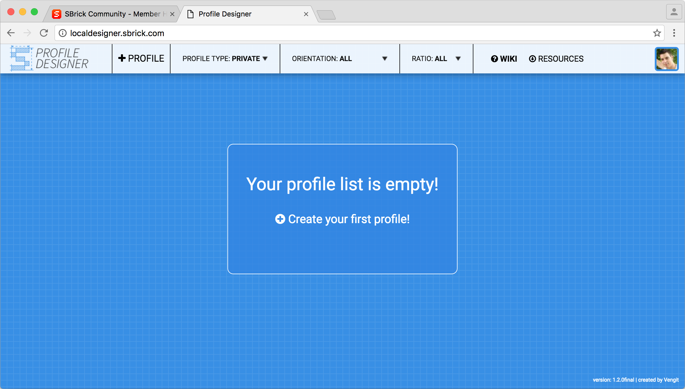
At the first start, you don't have any profile, and you have two choice. You can create a new profile, or you can switch the Profile type to Public, and you can create a copy from one of our official profile.
You can find the + Profile menu option at the header. By clicking on it, you can see a modal window, where you can set every required field. The window has two page.
By hovering your mouse over a field, you can see helper texts at the bottom of the modal window.
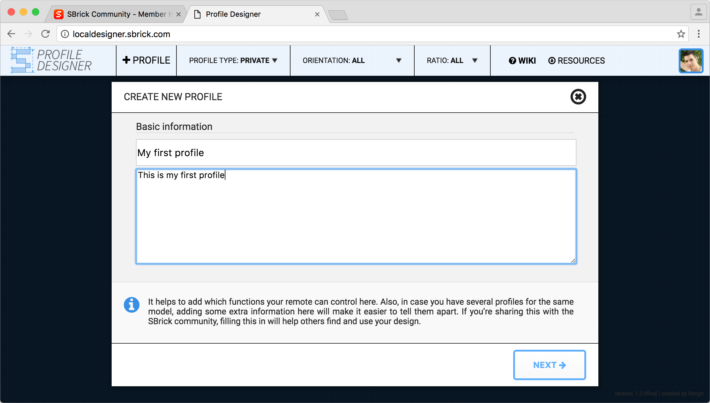
The Next button will be clickable when you fill out both the Name, and the Description field.
At the next page, you can set the device parameters: Orientation, and the Aspect Ratio. If you're not sure about your device's aspect ratio, please Google about it. If you're not select the right aspect ratio, the Profile won't be showed on your mobile device.
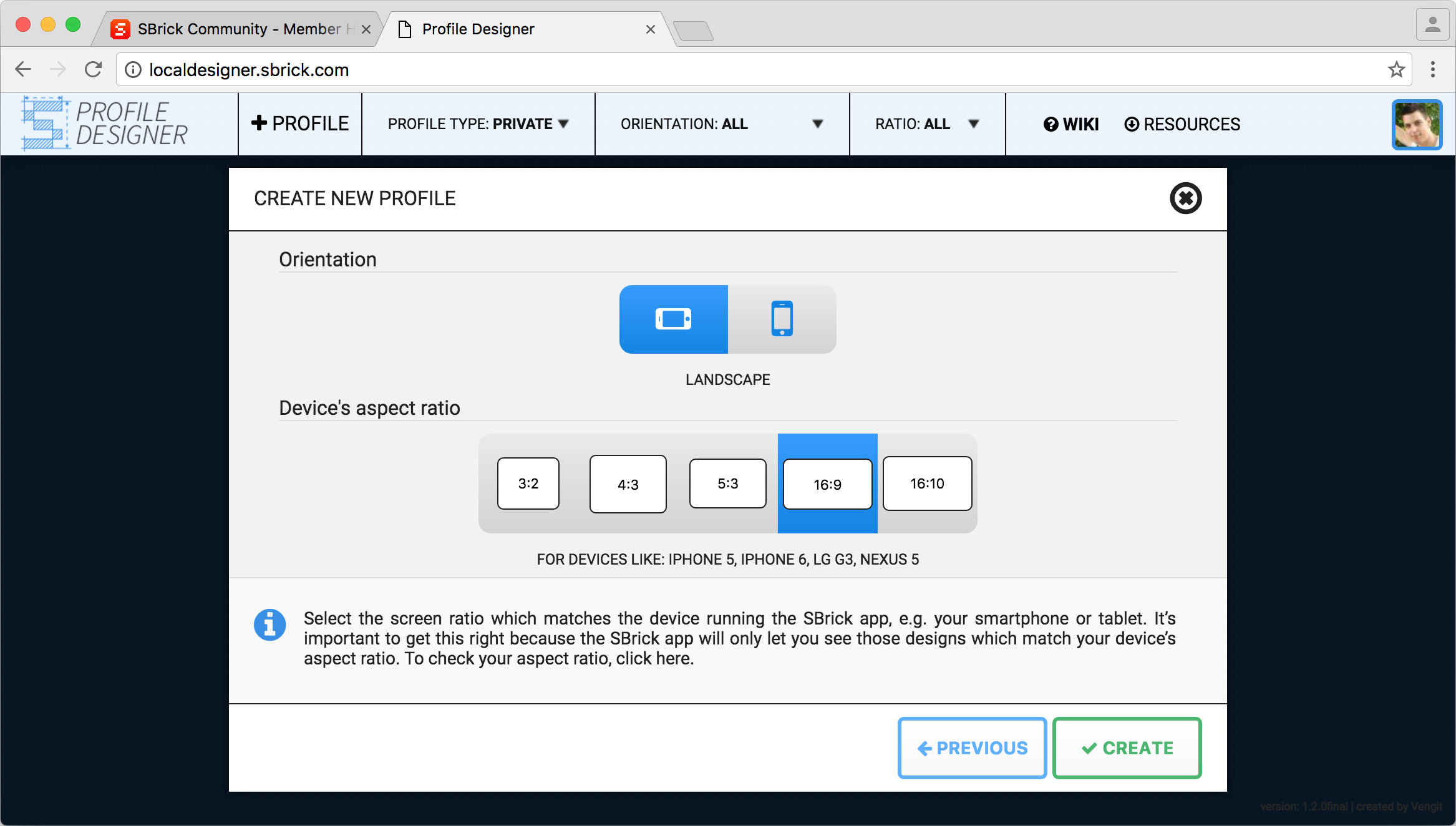
If you done with the settings, just click on the Create button, and you can start designing your new profile.
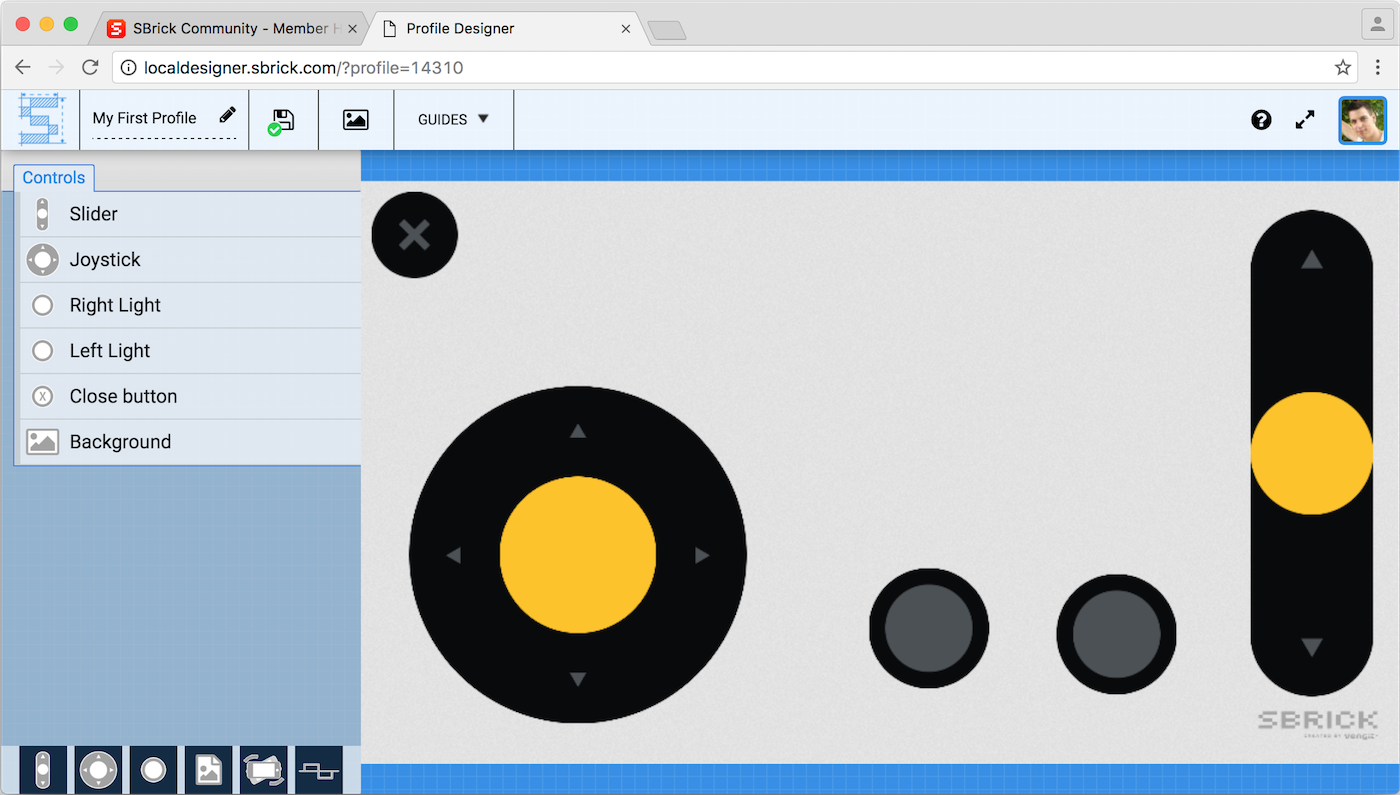
General options and functions can be found in the Header bar at the top. Moving from left to right, the first object is the Profile Designer logo. To the right of that is the name of the Profile. By clicking on the text (in the image above “Example Profile”) or pen icon, you will open the Editor view. Save your work at any time by clicking on the Save icon. The Resources button will show you the design elements available to you for creating Profiles. The Guides button allows you to turn Guides on and off; these are grid lines placed within the design space which makes it easy to align elements accurately.
On the the right side there are three icons and your user avatar. The Home icon will return you to the home page. The question mark icon opens a Help window. The icon with two diagonal arrows allows you to switch between full screen view and normal view. Clicking on your avatar will take you to your Social Profile.
When you move your mouse over an elemenet, it's oftenly shows some usefull information about it next to the Guide settings.
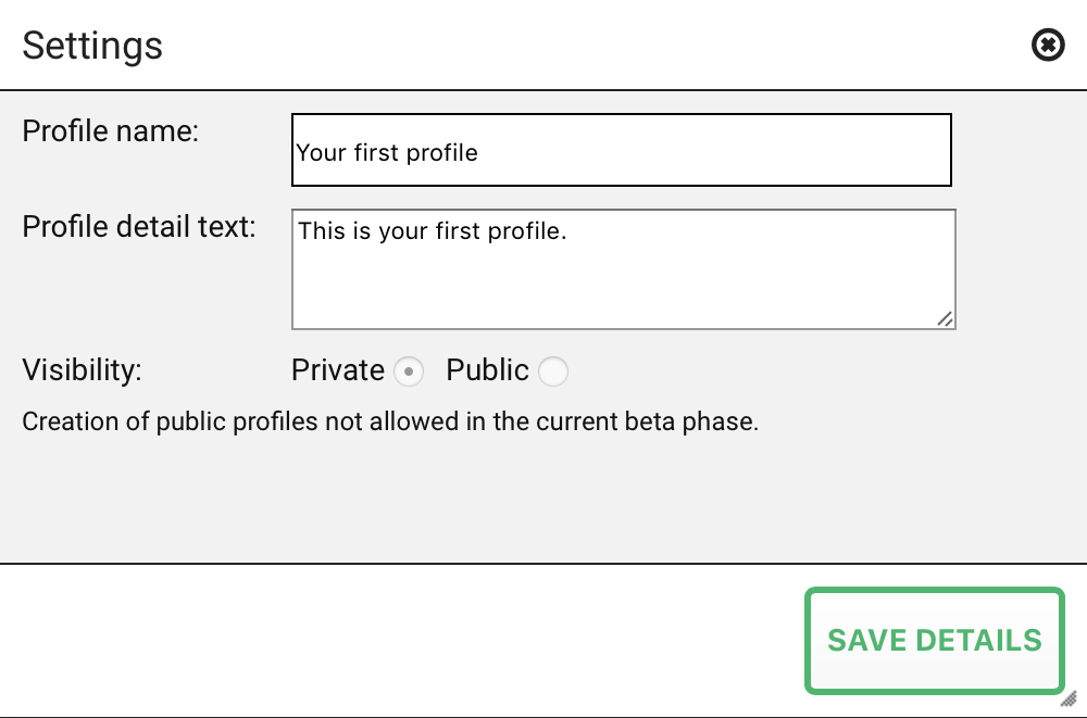
You can change the settings from within this menu. You can edit the Profile name, the profile detail text, as well as choosing to make your profile public (and thus usable by others). Make sure to click on the “Save Profile Details” bar below the options to save any changes you may have made.
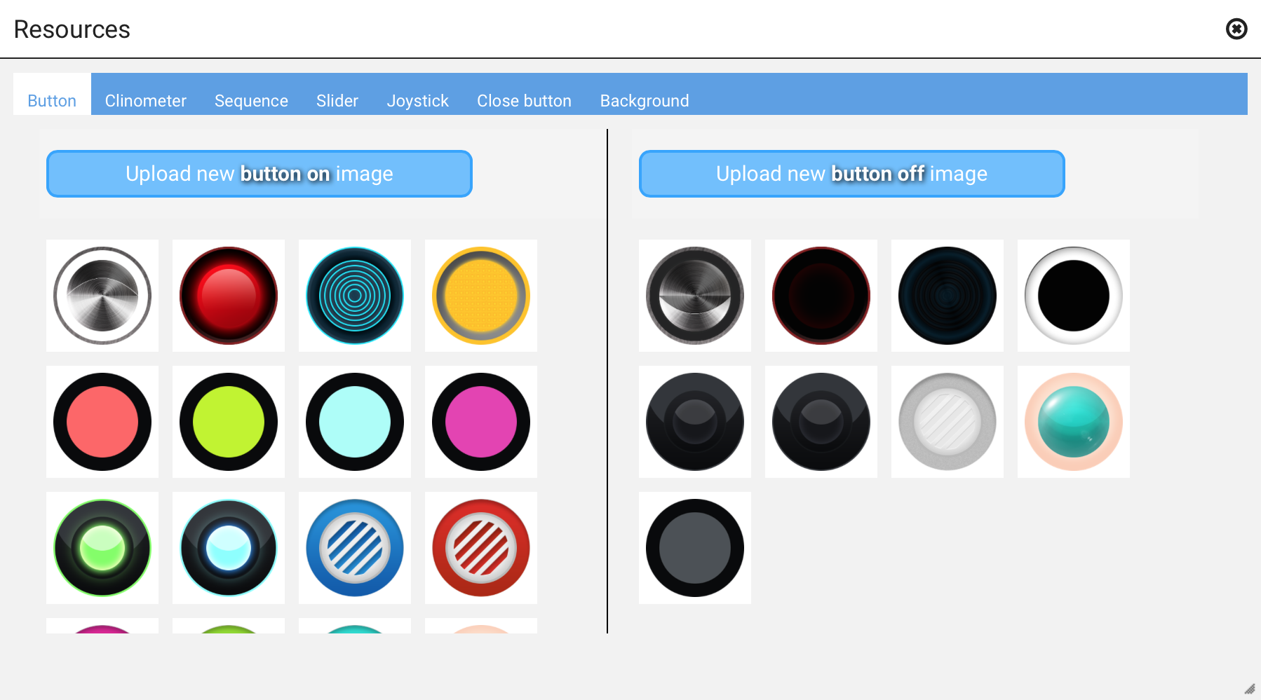
You can access all your image resources (and the default ones too) from the header. You can see a category list on the modal window's top. When you select one category, you can see all the associated resource below.
You can simply add new resources to the selected category by clicking on the blue upload button. The images can be .jpg, or .png formats.
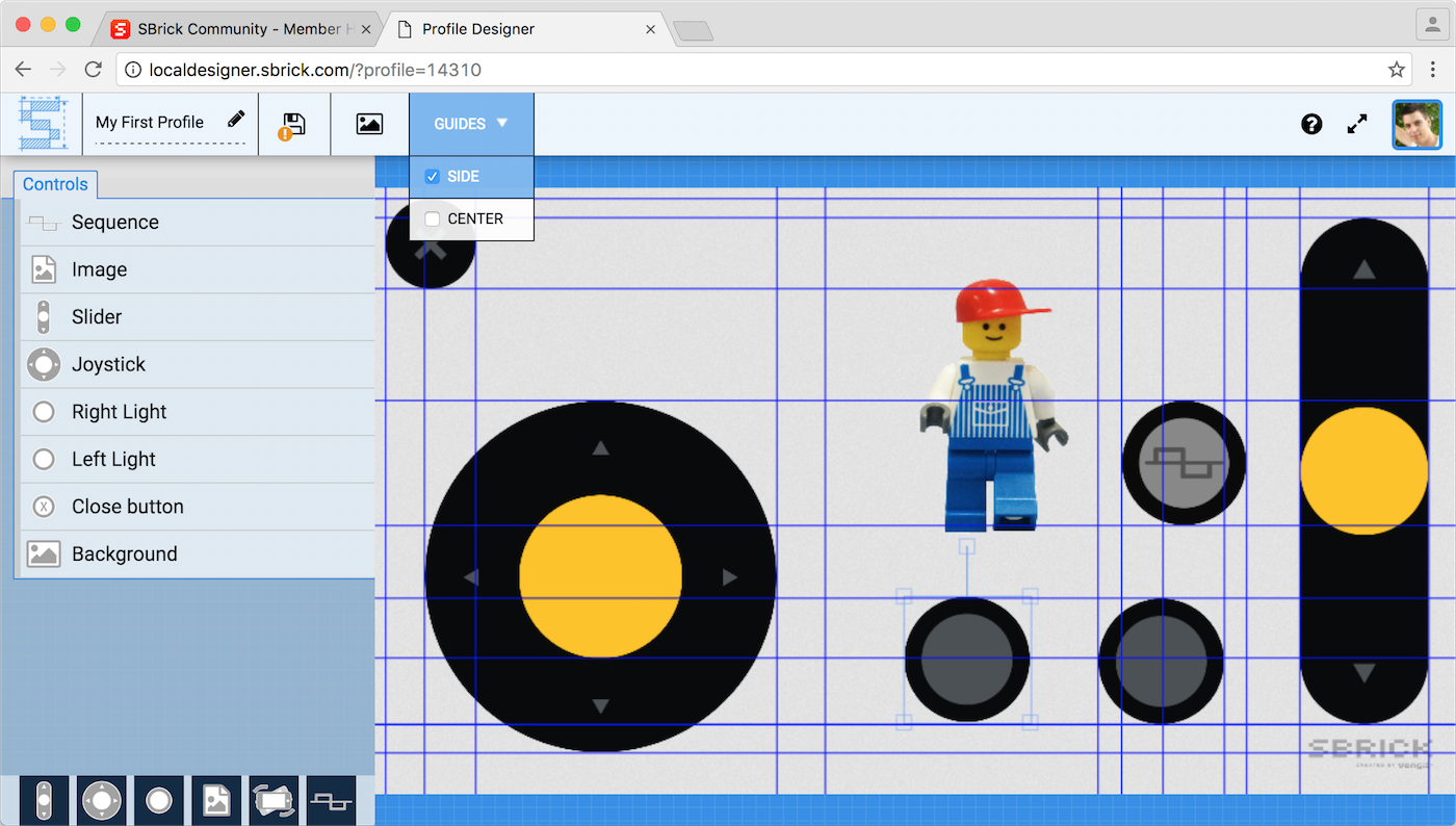
There are two options when it comes to have Guides turned on. You can choose between using Side or Center. If Side is selected (as above), then each design element is shown with gridlines sprouting from the edges of the elements. If Center is selected,then gridlines emanate from the center of each element (like a crosshair).
There is also a “sticky” property. If the elements are placed very close to each other then they will stick to one another.
At the left side of the window you can see a sidebar. There's the list of your controls, and by clic
The panel on the left is where you can find all the control options open to you. Below Layers will be listed all the design elements currently used in your design.
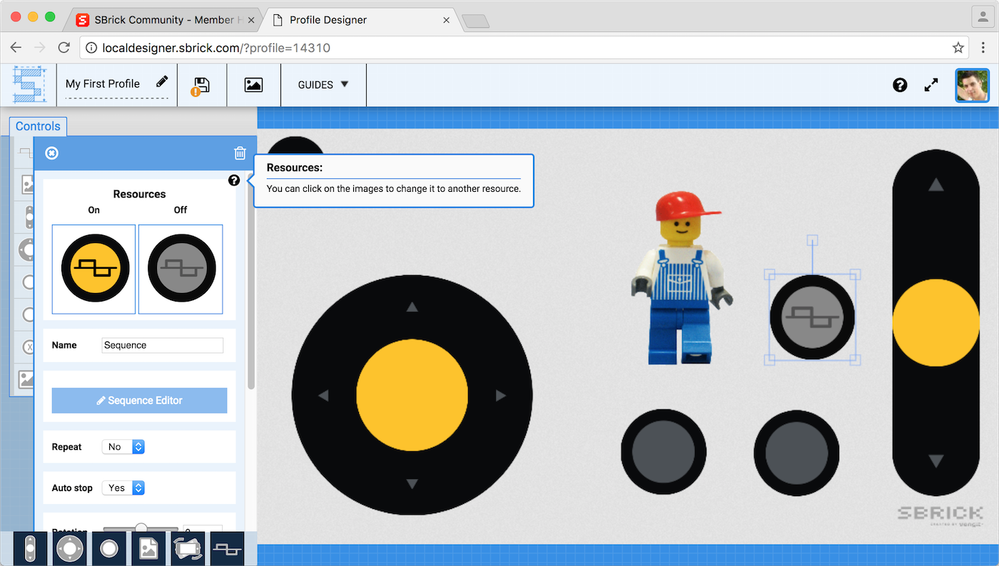
At the bottom there is a bar which contains six icons. These represent the six types of control interface you can use, namely the slider, joystick, button, custom image, clinometer, sequence (moving l-r). Clicking on one of the six icons will open a window where you choose edit the settings for that design element to control how it looks and acts.
The workspace within Profile Designer is the large area on the right of the image. It is the area in which you arrange your control elements and which mirrors how the Profile looks when playing. Clicking on a control will bring up an outline with which you can choose the size of your element. You can also add items to the workspace using Drag & Drop. Double clicking on a graphical element will open a window where you can edit the properties for the element. A single click on the background at any time will deselect the element.
In this part, we are going to explicate the Control Interfaces.
In the Profile Designer you’ve come across several parameters, including: output = 0.6 or rotation = 90 (degree) , which are self-explanatory.
There are output parameters which control the power output of the motors, this can be between -1 and +1. You can fine-tune this by values of 0.01.
We use pixels for all sizes in Profile Designer for controls and positions, with the exception of the rotation and opacity. For rotation we use degree, while you can opacity between 0 and 1, 0 is invisible, 1 is fully visible.
Every control (except the Background, which only has an image to change) has all these option.
Control Resources: You change change how your controls look here.
Each control element is broken down into composite elements which you can change. This includes things like the Background of the interface, colour of the
button, etc. You do this the same way as you would change the background, i.e. by clicking on the element in question and then choosing from the components shown, or by uploading one you have created using the Choose Files button.
Name: edit the name of the interface control by typing in the text box.
Channel: change the information to reflect the function of the control. We recommend using common descriptors like Steering, Acceleration, Arm Up, Arm Down, in case you wish to make your profile public for others to see and use.
Rotation: the slider interface allows you to rotate the object within the profile. Pulling the slider to the right will rotate the interface clockwise, while pulling the slider to the left will rotate the interface in theother direction. The interface can be rotated 90 degrees in either direction.
Position: With the X and Y parameter, you can set the position of the control interface.
Metrics: You can modify the size of control with the width and height parameter. By uncheck the Scale propotialy checkbox, you can tarnsform your control over it's original form.
You can remove the selected controls, by clicking on the trash can at the top of the sidebar. You have to confirm your will, and after that the settings bar will be closed, and the control interface is removed.
The Slider has one channel, and has two extra block that you can set up.
Points: there are two parameters to play with here, namely Zero Point and Start Point.
Zero Point marks the position where the interface does not produce a response. By default this is set to 0.5.
Start Point marks where the controller begins if the Profile is used. By default this matches the Zero Point - so when you activate the Profile it is idle. By changing this value you can program your Profile to start at a certain
setting.
Values: here you can adjust the minimum and maximum for your interface. By default the minimum is -1 and the maximum is 1, but you can change this by pulling the slider on the left.
Auto reset: You can set the behavior of the knob after you release it. If you set this value to Yes, the button will reset the output value to zero, if you set it to No, the button will stay where it is after release it.

The Joystick has two channels, one for the X and for the Y axis.
Values:Also, like at the slider control, you can modify the Values, but at the Joystick you have two min/max pair for each channel.

Output: You can define the output's strengh with it. It will define the strength when you press the button.
Auto reset: You can set the behavior of the knob after you release it. If you set this value to Yes, the button will reset the output value to zero, if you set it to No, the button will stay where it is after release it.
This control has only decorator purpose. You can put any image into your profile. It can PNG, JPG, or GIF.
Opacity: You can define the translucency of the image with it.
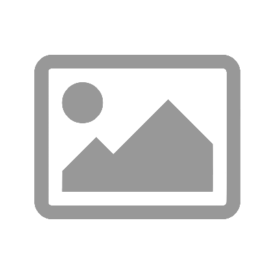
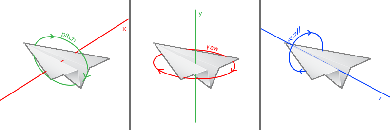
The Clinometer has three channels: For the Pitch, the Roll, and for the Yaw axis. You can find an explanation below:
This feature allows you to make use of the in-built movement sensor; you can do this by either pressing a button or holding down a button to control your model with the SBrick.
- Pitch; by tilting front and back you can control your model
- Roll; tilt tilting left and right you can control your model
- Yaw; by rotating your device left and right you can control your model
There is also a minimum and maximum level that can be set within all the three channels which determines the power delivered through each port.

Sequence allows you to start programming the SBrick by making it possible to send the SBrick a series of instructions it will carry out one after the other with the press of a single button. This makes it possible to do things like flashing lights or things far more complex.
When you add a new sequence control or open up a sequence settings, you may notice a blue button with a “Sequence Editor” label. By clicking it. You can see our new multichannel sequence editor. The old single sequence part of this control is gone. Every sequence can be handled by the new Sequence Editor.
When you click the Sequence Editor button. You can see one channel. If you open up a sequence created in an older version of the Profile Designer, the Editor automatically convert it into the new formatum.
You can add as many channels as you want to the editor by clicking to the Add Channel button on the Editor’s top. Every changes saving automatically, you only have to hit the main save button to save your whole profile.
There is also a REPEAT function. This can be turned either off/on. If engaged the sequence will repeat, so will start again from the beginning, once the last step has been completed.
Every channel has a Name, and has a Time frame parameter. The name defines the channel’s name. With the Time Frame parameter, you can plan how many time will taken by the current sequence, this is representing by a X/Y coordinate. The red trash button removes the sequence and all it’s data.
Please notice that every time parameter in the Editor is represented in seconds (s).
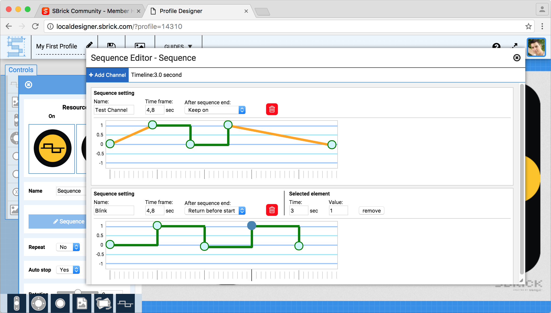
You can add new channels to the sequence editor by clicking on the + Add Channel button at the top of the editor. Every channel has three parameter that you can change:
Name: You can define the channel's name. This will be the identifier of the channel, and you can select it from the SBrick app channel selector, when you set up your profile on your mobile device.
Time frame: You can adjust a the length of the sequence by changing this value.
After sequence end:
This value only changeable when the repeat setting is turned of. With this you determine what happens once
the sequence finishes. The option are available are: Keep on, and Return before start.
Keep on: the output channel remains at the same value as the last output value of the sequence.
Return before start: The channel returns to the initial value before the sequence begain.
You can add a new node to the time frame by double clicking on it. They can be set and transiton type, and you can change it by clicking the line between two nodes. It will change the color, and shape. Orange curved line is for transition typed nodes, green is for set type.
When you clicking on a node, you can see a new area next to the sequence name and time frame settings.
Every node has two parameter and a remove button. With the Time input field you can change the selected node’s time paramter, and with a Value input field, you can define the selected node’s output.
Every sequence has a time marker part on the bottom, by hovering your mouse over the lines, you can see which time is there.


